
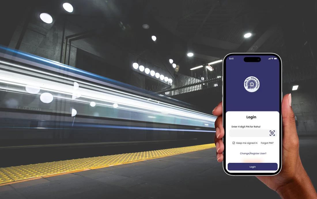
IRCTC - Rail connect App
StreamLine is a popular mobile banking app that enables users to manage their accounts, track expenses, and make transactions. The app, however, was facing usability issues that led to a decline in user satisfaction and engagement. Our goal was to redesign the app, improving its UX/UI to provide a seamless, intuitive, and enjoyable experience for users, ultimately increasing user retention and satisfaction.
2024
Booking app
$1.578 billion (2019)
Challenge
The app had a cluttered interface, making it difficult for users to navigate and find essential features. Users were facing issues with the onboarding process, which was affecting new user adoption rates. The app lacked personalization and customization options, making it less engaging and user-friendly.
Results
The redesigned app features a clean, clutter-free interface, making it easier for users to navigate and access essential features.
The improved onboarding process resulted in a 35% increase in new user adoption rates.
The addition of personalization and customization options enhanced user engagement, leading to a 25% increase in user retention rates.
35%
Improved onboarding process
25%
Increase in user retention
84%
Increase in time spent on website

Process
Research & Analysis: We conducted user interviews, surveys, and analyzed in-app analytics to understand the pain points and user needs. We also studied competitor apps and industry trends to gather insights
Information Architecture: Based on the research findings, we restructured the app's navigation and content, prioritizing features and information according to user needs.
Wireframing & Prototyping: We designed low-fidelity wireframes to visualize the new layout and navigation, iteratively refining them based on user feedback. Afterward, we built a high-fidelity, interactive prototype to test the design.
Usability Testing: We conducted usability tests with a diverse group of users to validate the design and identify areas for improvement. Based on the feedback, we made necessary adjustments to the design.
Visual Design & Style Guide: We developed a cohesive visual language, including color schemes, typography, and iconography, ensuring consistency throughout the app. We also created a style guide to maintain design consistency in future updates.


“ With our new visual branding and language in place, the new Shopify brand clearly captures the essence of our current and target customer base, our employees, and our values. ”

Conclusion
The challenge was a great opportunity for me to apply my understanding of UX design to assess and improve design decisions.It’s worth point out that most of the re-design revolved around my single user journey, which was very fun to story-tell but has clear drawbacks.Given more time, I would have loved to do more research and testing.
Click here to view the case study in detail .